Gouache Resist and Watercolor Illustration

The effect of gouache resist resembles a woodcut or linocut. It is quicker and less labor intensive than carving out a design: however, you end up with a single piece of art without the choice of multiple prints.
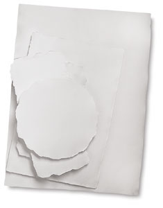
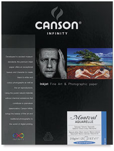
I used a sheet of handmade cold press watercolor paper for this illustration. The back of the sheet had a nice laid texture from the wire screen used to make the paper. I wanted to see how gouache resist would work with this more textured side. If you would like to see how gouache resist looks on a smoother paper, scroll down to the end of the tutorial.
Materials Used:
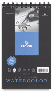
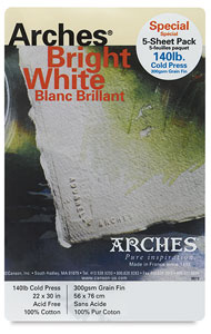
I used handmade paper for this tutorial, but either cold or hot press watercolor paper would work Arches Watercolor Paper . I've used both Arches cold press and hot press for ink drawings, pastel, acrylic, and what else have you. I have rarely used rough watercolor paper, as I'm just not quite brave enough for that.
Pencil - Cretacolor Monolith Woodless Pencil
Tracing paper -
Strathmore 300 Series Tracing Paper
White gouache -
Holbein Artists' Gouache
- Gouache is opaque watercolor paint. Don't use acrylic-based gouache paint for this exercise.
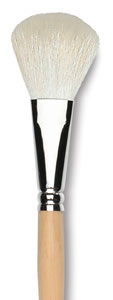
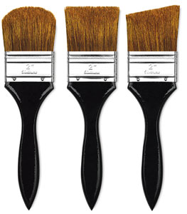
Watercolor or craft brushes -
Texture Set of 5
Painter's tape
Warp resistant support board -
Wood Painting Boards
Old toothbrush that won't be used again
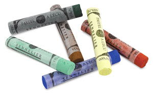
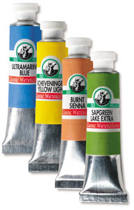
Watercolor paints -
Maimeri Blu Watercolors
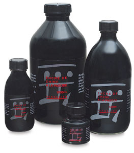
Speedball Super Black India Ink -
Speedball Super Black Waterproof India Ink

My cautionary tale against using old India ink for gouache resist begins with the above painting. I used a bottle that I'd had over six years. After several hours of work, while I was rinsing off the resist, most of the India ink washed off as well. All that was left was the same disappointing blue you might have got from a ballpoint pen. I hoped that adding watercolor would turn it into a happy accident, but I still wasn't satisfied with the result. So choose a good, fresh India ink! (I've never had any trouble with Speedball Super Black ink, no matter how old the bottle is.
Applying the Gouache Resist

After sketching out my design on tracing paper, I turned the sheet over and scrubbed pencil onto the back side of my drawing. Then I turned the sheet over again onto my sheet of handmade paper. Using firm pressure, I traced over the original lines of my sketch. The pressure pushed the scrubbed pencil marks into the watercolor paper, transferring the sketch.

Using painter's tape, I fixed the watercolor paper onto a board. If the paper bends at all after the gouache dries, the paint may loosen or flake.
I began painting in water-based gouache where I wanted to save whites. Everywhere that I didn't paint gouache would become black in the next step. I worked left to right, top to bottom, so that I wouldn't set my hand in wet paint.
Water can be added to the gouache so that it flows easily from the brush. If the paint is too thick, it might leave rough marks in the coverage. If the paint is too thin, it might leave a crackle surface after it dries. Either effect can be used intentionally to add texture to the painting.
If gouache gets where it shouldn't be on the paper, let it dry. Then go back in and gently scratch off the misplaced gouache.

As I painted, I thought about how my strokes could add interest to the final painting. For example, I followed the curve of the pumpkins' ridges, and stippled the hay.
Inking the Surface
The gouache needs to be completely dry before proceeding to the inking. I let the painting dry for several hours; overnight would have been better. I held my hand a few inches over the surface to feel if any coolness from evaporation was still rising. I further dried the paint with my hairdryer blowing from a few inches above the surface.

I chose the softest mop brush that I had for this next step. A stiff bristle brush would be more likely to scratch the gouache.
Holding the board at an angle, I applied a wash of black ink just as I would for a flat wash of watercolor. I poured out plenty of black ink into a cup so that I would have plenty of ink accessible quickly. I filled my mop brush and gently stroked across the top of the paper. A thin bead of excess ink collected along the bottom edge of my stroke. I immediately filled my brush again and made a second stroke slightly overlapping the first. I continued overlapping the juicy strokes all the way down the sheet.
If flecks of paper showed through in places, I dabbed ink on top of those areas. I never scrubbed the brush into the gouache.

I left the board flat to dry for an hour or so.
Removing the Resist

Taking the dry painting into the bathroom, I splashed water over the surface and began to gently brush off the gouache. The gouache and the dried ink that was on top of it mixed into a grayish sludge that washed off easily.

After a few minutes of brushing, the grayish sludge stopped coming off and the water ran clear.

Any residue gouache would cloud the watercolors I would use next. Just to be sure, I gently brushed the surface with clean water and my mop brush.
Coloring the Illustration
If I had wanted a softer look, I could have started in with my watercolors while the paper was still wet. But I wanted more controlled edges, so I again let the paper dry.

In some areas, the watercolor bled out in unpredictable ways. This may have happened either because I rubbed off the sizing while brushing off the gouache resist, or because of the inconsistencies sometimes inherent in handmade paper. The ink lines still held the drawing together, so these color bleeds added a nice spontaneity to the illustration.

I liked the broken line effect of the India ink on the laid surface; however, there was one place that really didn't look right. The axle hole of the wooden wheel was missing the bottom rim, and green watercolor had bleed into the area.
I went in with a fine detail brush and dry brushed in the missing edge.

I let the India ink dry for a minute or two, then lightly scratched out the green paint from the rim.

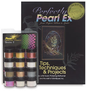
Beyond watercolor, I could have further embellished the illustration with pastel, colored gouache, or Pearl-Ex powders (click http://www.dickblick.com/products/jacquard-pearl-ex-pigments/ )
I used hot press Arches for this painting of Quebec City's Basse-Ville. I chose predominately sedimentary watercolor paint, then added colored pencil after the paper had dried.